One of the most common uses for our software is to provide a graphical front end to existing data, so that management can get a clearer picture of the current situation, and can model alternative solutions should problems arise.

The form and functionality of such an interface is entirely down to you - the aim is to provide a tool that eliminates unwanted complexity and speeds up decision making in your particular situation.

Examples

The examples below show just a few of the sorts of project we have been involved with, and the diversity of the solutions we can develop.

Pilecap visualisation

click image to enlarge

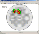
This model was developed for a nuclear power company, and is designed to visualise potential access conflicts when carrying out maintenance of a nuclear reactor. The diagram shows the layout of the pile cap, and is linked to a project plan for a set of maintenance or inspection tasks.The user can step through the current plan on a shift by shift basis and establish whether at any stage there will be an overlap between the footprints of the machinery carrying out the work, and so identify any potential problems.

Railway route map

click image to enlarge

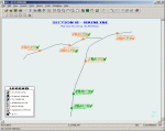
This screenshot shows part of the user interface developed on behalf of a train operator who had a large programme of station refurbishment. The user can navigate through a series of maps corresponding to increasingly detailed portions of their routes, with each station colour coded according to the progress of work at that location. At the highest level of detail shown here, a series of coloured icons next to each station identify progress for each of the major work packages.

CONOP visualisation

click image to enlarge

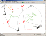
The client in this case was interested in exploring the potential interoperability between various military systems at any date in the future, based on the current delivery schedules and the known capabilities of each system. The user is able to develop a scenario by placing icons representing the systems of interest on the screen and connecting them with their supported communications links. The system then analyses the scenario based on a given date, and colour codes the graphics to indicate the interoperability of the systems at that date. 

Stakeholder Presentations

It is very simple to use this approach to combine data from multiple external sources into a single unified view of a large programme of work. When driven by live data extracted from operational systems, such a dashboard can replace the traditional PowerPoint presentations demanded by management or external stakeholders, eliminating the need to repeatedly hand-craft slides from complex data and ensuring that the visualisation is up to date and completely in line with reality.

Further Information

Contact us now to arrange a product demonstration or for details of our no-risk proof of concept service.

If you are not based in the UK, we can deliver live demonstrations to your desktop over the web, with toll-free international conference call facilities.

Overview QEI Exec LinearPlus Terra-6
Overview Project Management The Multi-Project Environment Earned Value and Performance Linear Projects - Time Chainage Visual Manufacturing Maintenance Optimisation Interactive Dashboards Automated Report Publishing
Overview QEI Exec LinearPlus FAQs
News Events
Search Advanced Search
Company Profile Services Customers Partners
PCF Offices Resellers Contact Form